Wednesday, 15 December 2010
Monday, 13 December 2010
How did you use media technologies in the construction and research, planning and evaluation stages?
From planning until the end of my project, i used many different media technologies during the construction of my media products. From starting at the very beginning, i started researching different media products:
- Professional film magazine covers
- Professional film posters
- Professional horror genre trailers
- horror music that would be suitable
the group started by researching different film trailers on the Internet using www.youtube.com.
we looked at many different types of trailers, e.g horror, action, comedy ect. we also found trailers that had been edited with a voice over to make them come across as a totally different film. This helped us to understand about how the quality of editing can really make or break a trailer, we have learned the importance of good editing and wrote down the things that we thought were very important and had to be added within our own media product.
there was many different trailers we looked at, and to remind us of the basic's we had to upload the video's to our blog, to post the video's from YouTube onto our blog we had to share the video and use the code. We also had to create our own grids of nine where we print screen shots of a trailer, or a music video and wrote about the angles and shots that were used and how they had an effect onto the audience. we uploaded these picture's using www.scribd.com we had alot of trouble uploading these grids of 9 however we managed to get there in the end.

we uploaded images of professional film magazine's and posters so we could easily go back and remember what the basics were if we didn't have our list with us which we also used as a backup. we also wanted to display that we have done alot of research into stereotypical media products that we could compare our own too. We uploaded them by using blogspot's own up loader.

After we completed all of our research and had a pretty good idea about what each media product had to include, we then wrote a list in our book so we could keep going back to it to remind us as well as the pictures we had already uploaded to our blogs which reminds us as well. we started to plan our trailer by using a sheet of paper that had a grid set out, we then manually drew our own initial idea's then came together as a group to decide our final idea's for our horror trailer, we then scanned our storyboards using a scanner which then copied onto a memory stick, which we then copied from the memory stick onto the mac we was using. After uploading our storyboards, i created a mood board for the genre of film that the groups trailer would be. i did this by going onto www.google.com and typing in words that are related to scary or a horror theme and copied and pasted them onto a word document which ended up looking like a montage, i uploaded this again by using scrib.d and uploaded it onto my blog.


Media Poster and Media Magazine cover
to create our film poster and magazine cover, we used photo shop to do most of our main editing and we used a number of different techniques including the douge tool and the lasool tool to cut out pictures with no outlines so they look professional and good quality. From creating a magazine cover last year we had pretty good experience with photo shop although we still did need some help, however with the use of the Internet as well we knew how to do most of the editing. we rescaled some of the pictures for our film poster and mostly copied and pasted images from the Internet for the advertisements of other films being promoted and used the lasool tool then rescaled it and moved it around the page for where it looked most suitable. we changed the colour of the 'R' for our magazine cover title we did this by using the wand tool and then changing the colour so that only the one letter was a different colour. we also took the small print from another film poster and edited onto our own and because of the colour of the black poster we extracted it from it blending it really good and looked like we had edited the words in ourself. For the title, we used the lasool tool to highlight the letters then used the rubber to rub out he white background so that it was transparent and it would blend onto the background nicely!

Media Trailer
We created our trailer using, premiere pro. firstly we shot all of our footage using one of the schools video camera and a tripod. however our first filming session we picked up a broken tripod so some of our shots weren't straight however we took a note of what shots to redo and the next time we went out we brang a working tripod and reshot the footage that we needed and it looked alot better. we used these camera's and tripods to complete our filming.


We then uploaded all of our footage onto premiere pro but before we did anything we looked through it all and deleted some of the scenes that didnt come out so well and some of the scene's where we was just messing around and we deleted the bad shots, after we viewed all of the shots and we had some very good footage that we could use, before we uploaded the footage we had to uploaded the music we wanted from YouTube so we dragged the file into premiere pro and dragged in onto the bottom rows of the editing section and cut it to the length we wanted it, we then dragged each bit of footage chosen into the upper lines and cut them to the length we wanted them. we then added cross fades and dissolves so that all of the shots blend in nicely together and there not so quick cuts. when we wanted to music to change we added in a scream so that it would separate the two bits of music as well fit in with a shot as well as building up to the end slow music where the titles are being shown. we edited the quick cuts so they all fitted in with the music which fitted in really well!


for my questionnaire i went onto gadget, and added in my questions and changed the date when the poll is over so there is long enough for people to answer. because i didn't have enough answers i went round to ask people face to face, i then used the scanner and pasted my sheet of questions onto my blog manually. i copied and pasted scenes from my trailer for evaluation purposes, to do this i held down CTRL, CMD and 4. this then gave you the option of cutting the image out and it automatically saves to desktop. The main website i used for all of my blog work was www.blogspot.com, where i posted all my planning and researching as well as the final products. I used a number of technologies for the planning, research and construction of my media products, from studying media last year also helped me to complete my media work this year as i would not have know how to use most of the programmes. by using all of these technologies and programme's on the macs i believe that the group's media trailer and ancillary task's have came out looking professional and therefore reflect the quality onto the amount of hard work put in.
- Professional film magazine covers
- Professional film posters
- Professional horror genre trailers
- horror music that would be suitable
the group started by researching different film trailers on the Internet using www.youtube.com.
we looked at many different types of trailers, e.g horror, action, comedy ect. we also found trailers that had been edited with a voice over to make them come across as a totally different film. This helped us to understand about how the quality of editing can really make or break a trailer, we have learned the importance of good editing and wrote down the things that we thought were very important and had to be added within our own media product.
there was many different trailers we looked at, and to remind us of the basic's we had to upload the video's to our blog, to post the video's from YouTube onto our blog we had to share the video and use the code. We also had to create our own grids of nine where we print screen shots of a trailer, or a music video and wrote about the angles and shots that were used and how they had an effect onto the audience. we uploaded these picture's using www.scribd.com we had alot of trouble uploading these grids of 9 however we managed to get there in the end.

we uploaded images of professional film magazine's and posters so we could easily go back and remember what the basics were if we didn't have our list with us which we also used as a backup. we also wanted to display that we have done alot of research into stereotypical media products that we could compare our own too. We uploaded them by using blogspot's own up loader.
After we completed all of our research and had a pretty good idea about what each media product had to include, we then wrote a list in our book so we could keep going back to it to remind us as well as the pictures we had already uploaded to our blogs which reminds us as well. we started to plan our trailer by using a sheet of paper that had a grid set out, we then manually drew our own initial idea's then came together as a group to decide our final idea's for our horror trailer, we then scanned our storyboards using a scanner which then copied onto a memory stick, which we then copied from the memory stick onto the mac we was using. After uploading our storyboards, i created a mood board for the genre of film that the groups trailer would be. i did this by going onto www.google.com and typing in words that are related to scary or a horror theme and copied and pasted them onto a word document which ended up looking like a montage, i uploaded this again by using scrib.d and uploaded it onto my blog.


Media Poster and Media Magazine cover
to create our film poster and magazine cover, we used photo shop to do most of our main editing and we used a number of different techniques including the douge tool and the lasool tool to cut out pictures with no outlines so they look professional and good quality. From creating a magazine cover last year we had pretty good experience with photo shop although we still did need some help, however with the use of the Internet as well we knew how to do most of the editing. we rescaled some of the pictures for our film poster and mostly copied and pasted images from the Internet for the advertisements of other films being promoted and used the lasool tool then rescaled it and moved it around the page for where it looked most suitable. we changed the colour of the 'R' for our magazine cover title we did this by using the wand tool and then changing the colour so that only the one letter was a different colour. we also took the small print from another film poster and edited onto our own and because of the colour of the black poster we extracted it from it blending it really good and looked like we had edited the words in ourself. For the title, we used the lasool tool to highlight the letters then used the rubber to rub out he white background so that it was transparent and it would blend onto the background nicely!

Media Trailer
We created our trailer using, premiere pro. firstly we shot all of our footage using one of the schools video camera and a tripod. however our first filming session we picked up a broken tripod so some of our shots weren't straight however we took a note of what shots to redo and the next time we went out we brang a working tripod and reshot the footage that we needed and it looked alot better. we used these camera's and tripods to complete our filming.


We then uploaded all of our footage onto premiere pro but before we did anything we looked through it all and deleted some of the scenes that didnt come out so well and some of the scene's where we was just messing around and we deleted the bad shots, after we viewed all of the shots and we had some very good footage that we could use, before we uploaded the footage we had to uploaded the music we wanted from YouTube so we dragged the file into premiere pro and dragged in onto the bottom rows of the editing section and cut it to the length we wanted it, we then dragged each bit of footage chosen into the upper lines and cut them to the length we wanted them. we then added cross fades and dissolves so that all of the shots blend in nicely together and there not so quick cuts. when we wanted to music to change we added in a scream so that it would separate the two bits of music as well fit in with a shot as well as building up to the end slow music where the titles are being shown. we edited the quick cuts so they all fitted in with the music which fitted in really well!


for my questionnaire i went onto gadget, and added in my questions and changed the date when the poll is over so there is long enough for people to answer. because i didn't have enough answers i went round to ask people face to face, i then used the scanner and pasted my sheet of questions onto my blog manually. i copied and pasted scenes from my trailer for evaluation purposes, to do this i held down CTRL, CMD and 4. this then gave you the option of cutting the image out and it automatically saves to desktop. The main website i used for all of my blog work was www.blogspot.com, where i posted all my planning and researching as well as the final products. I used a number of technologies for the planning, research and construction of my media products, from studying media last year also helped me to complete my media work this year as i would not have know how to use most of the programmes. by using all of these technologies and programme's on the macs i believe that the group's media trailer and ancillary task's have came out looking professional and therefore reflect the quality onto the amount of hard work put in.
Wednesday, 8 December 2010
What have you learnt from your audience feedback?
Our group dedicated alot of time towards finding out about what the audience like to see in a stereotypical film trailer, i included a questionnaire within my blog so the audience can answer the questions, and how we could improve our media products. however there wasn't alot of time for people to answer the questions because of how busy everyone was with doing there own. so i ended up going round and asked 10 members of the public that enjoyed watching horror trailers and asked them 10 simple questions, as i thought 10 was an appropriate number to work with so i get alot of different opinions as well as adding the few that answered on my blog.


This questionnaire benefited the group very well because after we collected the results, we made alterations to our promo work and trailer. starting with question one, we noticed that the public seemed to want a watch a movie trailer that didn't tell a story and was in fact random. when we looked at our own horror trailer we realised there were some shots that we could in fact swap to make it more random. our teacher also said that if we improved the shot sequence the trailer looked more smooth a professional, from knowing what the audience prefers we was able to improve our trailer by making the shots more random and not tell as much of a story.
Question number two: We wanted to know the results of this question desperately because one of our aims were to add as much mystery to the promo work and trailer as possible because we didn't want to give too much away, luckily when the results came back we found out that the audience would prefer mystery then giving away the plot within the trailer. if the results came back differently then the group already had a back up plan which would be to change some of the shots around to show a bit more about whats going to happen from the footage that we didn't include, however from the previous question this would of been hard without telling a story so were happy that we went with what the audience liked and preferred.
The group decided that question three was more a research question for future references then an actual plan to change the footage, the results came back pretty equal about how the killer would be presented. either covered up or made to look scary, however with the budget and time we had we didn't have the time and skill to make someone look as scary, so we thought if we covered our actor up and make him look mysterious then the audience would still believe that what there watching is real. When i went around with the my questionnaire a few people said they don't actually mind how the killer is presented or how it looks, as long as the scene is believable and looks professional then it still adds in the horror and killer theme.
We tried both man and woman killer in our trailer, we originally started with a woman however, when we lost a member of our group we replaced her with one of our male friends because we had more shots to do, we had to reshoot all of the shots that included the woman killer, but when we looked at our results from this question and was happy to see that most audience preferred the male killer, we asked why they prefered a male killer and we received feedback that the figure looked more intimidating then a female killer, the group were happy that we made this change instead of using the footage we already had of charlotte, it was extra work but it was all worth it.
We tried both man and woman killer in our trailer, we originally started with a woman however, when we lost a member of our group we replaced her with one of our male friends because we had more shots to do, we had to reshoot all of the shots that included the woman killer, but when we looked at our results from this question and was happy to see that most audience preferred the male killer, we asked why they prefered a male killer and we received feedback that the figure looked more intimidating then a female killer, the group were happy that we made this change instead of using the footage we already had of charlotte, it was extra work but it was all worth it.
The public weren't too sure about the next question, they wasn't sure if the main image on the magazine cover should be of the main actors. the group researched alot of film magazine covers and most of them did but we wanted to be different and add mystery so we just had the background of the woods, the feedback didn't really help us to make a decision as the results were either equal or people have chosen the option of 'Depends' this result didn't change our magazine cover as we had chosen to edit it in a certain way and decided we were going to keep it how it was.
The next question depended on what went into our trailer, we had shot footage of different endings, one was revealing the antagonist and the other was not revealing the killer. depending on the feedback we got determined on which ending we would use. admittedly the ending where we kept it all a mystery was shot better then the one revealing his identity. so when we added up the results we were happy to know that the audience in fact like mystery within there film trailer and would not like to know who was the killer, for a killer to be revealed in a trailer is rare but we wanted to be different and wanted to go along with what the public wanted to see if it was there choice.
We originally made a film poster not displaying the actors names, however from looking at our client feedback we in fact saw that most of the public i asked wanted to know who was in the film and who they would be watching, this shows that audience want to know alot about the film before they watch it. We then made improvements to our film poster and used the douge tool to lighten the bits we wanted and included the actors names, from the client feedback we have actually made our film poster look alot more professional and have used the forms of conventions in doing so.


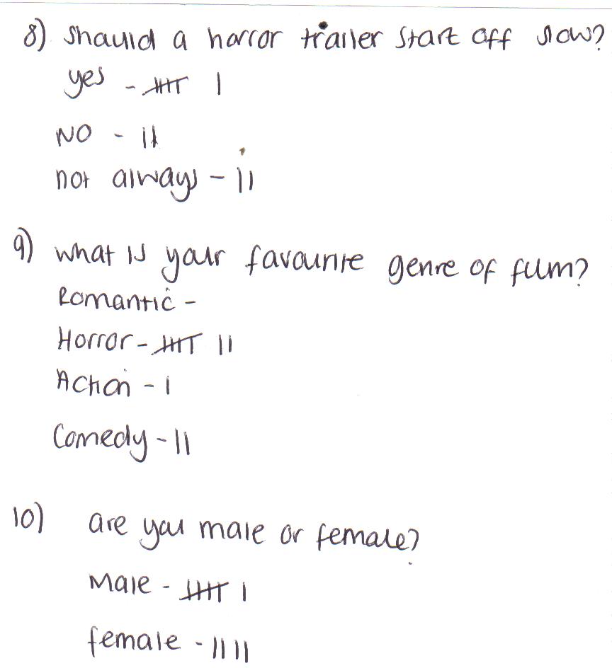
From previous research of other horror film trailers, we noticed that the majority of them start off slow and the music and intensity increases. we asked the public whether in there opinion the horror film trailer should start off with slow music and a slow incline, the audience feedback resulted in most of the public thinking that a slow start would be better, there were some that thought that not always should it start off slow and we kept this in mind, however while editing our trailer the shots we had lined up fitted in with the slow music perfectly and still went in with what the audience wanted to see and hear.
We wanted to know what the audience favourite genre of film was so that we could compare it with there answers, for example someone that only watches comedy may not know or could answer what was best for our film trailer but luckily for us the audience we asked all had a good idea of what a stereotypical film trailer should include! i also wrote down the results if we were asking males or females, this was pure research only to see what gender were answering most of the questions and linking up with there answers to find out more about them and the audience we was going for. Our audience feedback helped us alot through our promo work and trailer as we stuck with what the audience wanted to see and kept with the basic forms of conventions but also challenging them as well, we have learnt alot from what the audience had to say and the results have helped us improve our work phenomenally and make it look better quality as well as more professional.
How Effective is the combination of your main product and ancillary texts?
As a group, we had two main aims to complete all of our promo work and trailer.
-Fonts
we have used the same font for all of our products. within our film trailer we created title pages that displayed the title on a scary background and also used the same font for the 'coming soon' page however we made it much bigger then the title page because we thought that the title looked better being drowned within a black background. the group decided on having the font a large size for the trailer as we needed it to stand out. the color of the font was originally white with a black background, this fitted in perfectly with the genre of film we was creating. the only aspect of the font that varied was the size which we adapted for the product it was for and the amount of importance. the website that has been placed onto the 'coming soon' page is also in the same font, however we have rescaled to it to a medium because we don't want to distract the audience from looking at the main priority.


- to add as much mystery as possible
- and to create a combination between the main trailer and the ancillary tasks.
we wrote down our idea's that would link all the products together so that familiarity is created for the audience. this includes:
-Fonts
-Images
-Colours
- Sizes
- Sizes
-Words
-Titles
we started by choosing the fonts that we could used, and we researched many different websites that advertised scar fonts, in the end we found a font called 'Nightmare' off of http://www.dafont.com/.
we have used the same font for all of our products. within our film trailer we created title pages that displayed the title on a scary background and also used the same font for the 'coming soon' page however we made it much bigger then the title page because we thought that the title looked better being drowned within a black background. the group decided on having the font a large size for the trailer as we needed it to stand out. the color of the font was originally white with a black background, this fitted in perfectly with the genre of film we was creating. the only aspect of the font that varied was the size which we adapted for the product it was for and the amount of importance. the website that has been placed onto the 'coming soon' page is also in the same font, however we have rescaled to it to a medium because we don't want to distract the audience from looking at the main priority.
we used the same font for the film magazine and rescaled the title back up to large so that it is eye-catching and bold! we added a caption underneath using the same font but made it smaller so that the audience could then recognize that it was less important. from looking at the film magazine the audience should already have an image in there head that would trigger them to remember the certain combinations that we have included within our trailer and ancillary tasks. as a group we decided on matching all of the color schemes, as our font was themed black and white we rarely added color unless it was for the advertisements of other films or the main letter for the title of the magazine. it blended nicely as we had edited the background so that it looked very dark which matched the colors which also linked with the trailer as all the promo work and trailer have a very dark theme to them.

We used synergy for all of our media products, which shows that when they are looked at from an individual perspective, the quality isn't as high when all ancillary products are looked at together. All of these basic theme's link the work together and reflects the quaility of effect we out into them all. We also used this for our film poster as well. we used the same fonts to display the actors names along with the title and the caption. We kept all fonts and colours the same so they all matched up. we made the actors names smaller then the title and the caption smaller then the actors name. however the legal requirements shown across the bottom of the page is in a different font as we copied and pasted it from another film poster. we copied this because of the insignifcance to it.if we decided to creat our own this would have just been a waste of the groups time as it is so hard to read.


as you can see the fonts are the same, but different sizes. because of the colours they all blend in very well together and gives that horror theme style. i think the group definitely chose the right font for this genre of film. after researching many different fonts this was the best and most suitable we could find. we decided to keep the images the same for both the film magazine as well as the poster so they could be easily linked, however we removed some of our editing of the image for the film magazine as there should be some mystery left behind it. We wanted to audience to have seen the film poster, then see it being advertised onto a film magazine then remember that there was an image that was edited onto the poster and go back to have a second look at it. this would then be a good factor to make the public remember and reconize our film.


Our group had to come up with a caption that would fit in with the title and genre of the film. it had to be short but catchy so that the public could remember it. We wanted it to be mysterious and not give too much away, after many different idea's and option's the group decided on going with 'Death Lives here' this is mysterious because the public dont know what context death is meant in also 'Here' could mean many different locations, but the fact we have our background as a forest gives an indication to the audience about what to expect the trailer to include so the audience are not being mislead and wont end up being dissapointed.
In what ways does your media product use, develop or challenge forms and conventions of real media products?
Film Trailer
After researching thoroughly the true conventions of a professional Horror film trailer, i had a lot more knowledge about what i had to include withinmy own media product. Some of the basic conventions that i planned to follow:


-to start off with a slow beginning and build up to a fast climax.
-random cuts throughout the film, and notto give away too much of the story.
-must be gripping and tense and create a uncomfortable atmosphere for the viewer.
-the captions have to build up tension as well so that the reader would want to continue watching.
we used the forms of convention when it came to deciding what music to use in our own media product, we knew we had to start off with a slow creeping music and finishing with a fast upbeat adventurous piece. in our own media product we used the slow music that consisted off slow piano and weird violins that went well with our shots as we fitted them in perfectly so that the movement of the shots linked in with the music to look more professional and aggressive. After we researched many different trailers we often noticed that music was separated and linked but a scream or a bang of some sort, we then used the same technique as there is a vast difference between the two so this idea helped us to edit so it all went as smoothly as possible.
(Paranormal Activity is the scream that separates the two musics)
We stuck to a stereotypical forest location for our horror trailer, as that was our initial idea's when we were drawing our storyboards very early on in the project. we took with us 3 cars that helped us with many different brightness of light that we could use for different shots. we tried to shoot from many different angles, to try and give ourtrailer that interesting and uncomfortable style about it. we challenged the forms of convention because within our trailer we didn't have dialogue in it whats so ever, we wanted to keep the audience interested by the horror style of filming that we took so long in planning aiming to get just right.
we wanted to develop the conventions as we have used someconventional and generic shots such as stereotypical themes e.g the scary pram and the dark forest along with scary children ect, something you would expect to see within a horror trailer followed by the themes being in the actual movie, although we have shots of our actors dirty knees to insinuate that she has been rolling around and falling over because of being chased by the killer which some viewers would consider as arty. we believe that this was pushing the forms ofconventions as being different and unexpected, one of our last shots that we have placed after the title page and before the 'coming soon'. By having the shot of jade crawling along the floor and being pulled up by her hair, comes across quite different and arty. these two shots are developing conventions as you would not expect to see them in a stereotypical horror trailer.
Film Poster
From researching different horror films posters, we wanted to base our own film poster around the stereotypical poster but adding our own twist to make it individual and to reflect the quality back onto our group. we wrote down some idea's about what we wanted to include on our film poster and wrote downhow we was going to make it look as professional as we could.
the basic film poster included:
-small print somewhere along the bottom of the page because of the legal requirements.
-either an image of the actors, location or a symbol that links to thefilm
-the title of the film
-a caption that links to the film
-actors name's that are included within the film
we chose to add an image for the background but edited a silhouette of a man and a pram so that the poster looks as if its all linked. we used the forms of convention and added in most of the themes that a stereotypical film poster would include. we edited small print at the bottom so that it would blend in but is still visible. the title of the film has been placed at the bottom ofthe poster because we didn't want to distract the audience from the main image of the forest. we used the douge tool to lighten the bits we wanted and used the same font so that all promo's have a link. we edited in the actors name's underneath the caption, which is another thing that we followed the conventional forms by adding a caption to the top in a smaller font so its out of the way but still readable.
we challenged the conventional forms by not having an image of the actors as the background for the poster, (the ring) poster was the only other poster i could find with an image other then the actors, so we followed these conventions instead. i think this has a better effect as it leaves more mystery and the audience feel as if they have to watch the trailerto find out more. mystery was a theme that our group based everything on as we didn't want to give too much away for any of the promo work. we developed the conventional forms by editing in our images in instead of taking a picture of the actors, this is another thing that would be considered arty as we used photoshop to create a man running, a picture that we created and didn't use already as an image. not many film posters have done this unless they have created a creature and even then it was already made from a picture.
We developed the forms of conventions, with our film poster because of the way we edited our own images onto the poster to make it individual. this reflects the quality and time that the group put into the product, which shows that wewanted to get it just right and that would go to extremes to make sure that our poster looked the most professional.
Film Magazine
From looking at many different film magazine's and wrote down the basic's about what a film magazine consisted of. after completing and researching magazine's and the conventions for our AS media work last year we thought we would find this promo the easiest to complete. However after looking at other film magazines, there were many basic things that had to be included:
- Bar code
-magazine title
- logo
-main image
- other advertisements
-date
most of the film magazine's we looked at actually had a picture of the actors for the main picture, but our group thought we wanted to keep the mystery within our image so we just kept an image of the location which was the same image we used for our film poster, this would also help the audience to link all the promo work together. by keeping all the color schemes the same, the public can look at one product and immediately the film would pop up into there head and then they would feel the need to watch it.
we edited out the images of the pram and the man because we wanted to add mystery to our promo work. we used the forms of convention by adding a bar code, however we placed it at the top along with the title because we wanted more space along the bottom and nothing to distract the audience from the title and advertisements for the film. like other magazine covers we also included other information about other film on the market as well, but using the forms of convention we kept the font very small along with the images. we have placed the title of the magazine along the top which is quite bold and readable but also easy to recognize that it is the title of the magazine. we created a logo for the magazine using photoshop like other magazines that have logo's.
we developed the forms of conventions by not adding in much information about other films, as well as the magazine being mysterious because of the lack of information that is shown on the front cover, we also chose not to include a main image of the characters because we didn't want to give too much away. the color scheme's we used lacked bright colors but we chose to make the 'R' red because of how many things it could stand for (see making of film magazine). we challenged the forms of conventions as well by placing the bar code towards the top half of the page instead of placing it bottom right hand corner. we did have our reasons for doing this as ive already explained. we kept the front cover as minimal as possible because we didn't want to distract the audience from what they are meant to have been focussing on.
Editing The Trailer
Introduction
After deciding all the shots that we wanted to include within our trailer, we had a bit of editing to do to make it run as smoothly as possible, this first shot for example we took and copied from another trailer, we pasted it in with our shots to make it look professional, what the group decided on what to fade the scene into the next scene to create that horror theme that also went along with the music. We faded the first scene into this scene at a slow pace to create tension, i think it looks most effective because of the colours, the first scene is very bright however as it's fading into this shot the colours become a lot darker and add's to the scared factor. this scene we also took from another trailer as it has dark colours and fits in perfectly.


Captions
We wanted to keep the caption similar, using the same font and background ECT. however the group decided it would be far more effective to changed the last caption because of the sudden break into music, we wanted to edit the caption so that the words cam up at different times,different fonts and also slower then the other captions, we thought this would build up tension because the drop. we found an scary image on google and placed them for the background the colouring fits perfectly for a horror trailer then used white font to fade outwards towards the audience, we made it so there was plenty of time to read the sentences.


Can you drive away from your past?
and look forward to your future
what if someone doesnt..
let you, forget.
End Credits
The group decided that we wanted the end bit to finish with a shot from what we filmed, we found another background on google to use for the background to display the adveritisments for our film. Jess then used the same font that we did for all our promo's so they are all reconizable and create advertisments as well as information. We edited so that the title appeared first after the scream and that it would come in with the slow music, we then cut it to a shot of jade and the killer and used a cross fade that dissolved into the 'Coming soon' page.


Scream Music
at 0.30 seconds we used this scream to link the two musics together because of the vast difference, the scream was very fast and unexpected, we thought this would fit in perfectly form the fast music back to the slow music to conclude the trailer up. this scream would also fit in well with one of our shots as it was be surprising and the audience wouldn't see it coming.
Trailer Fast Music
Jade strangely found this video on youtube some how, and we decided to use this because of the scary theme to it. we liked the rocked style and thought that it would fit in nicely without our introduction music as it would of been a massive contrast to the slow piano music that was going to be played first. we have cut the music so none of the words are in there because the language is german, but we kept the soundtrack and just repeated what we needed.
Trailer Introduction Music
We chose this soundtrack to introduce our trailer, as like every other trailer, we wanted to start off slow. we found this on youtube after pages of searching for the correct and most suitable music for our trailer, we think this was the best one we found because of the slow piano and the increase and decrease of sound that creates tension. we were planning on linking the trailer depending on the music so it all fits in and looks professional.
Tuesday, 7 December 2010
Mise En Scene and Location
The theme of our trailer is horror, so the suitable thing to do is to link everything we use and wear to a horror theme. The actors within the trailer are returning back from a party, the girls have high spirits and are singing along to the music while videoing themselves with a hand held camera. suddenly the car runs out of petrol and the girls are stranded on the side of the road in the middle of a woodland area that they are not familiar with. There is a killer on the lose but the face is never revealed, he is wearing dark clothing and can hardly ever see anything that would trigger who the killer is. the girls are chased around the woods, while different shots are filmed of them in situations and how there feeling.


Mise En Scene
As the girls are returning from a party they have to be dressed quite casually but dressed up with all makeup on and hair done. they are wearing dresses and coats, not suitable for running around in the woods. the car we used was Leanne's as it was the car that had the most space in the back for the shot of the killer. we smothered makeup down our faces to make it look like the girls were distressed, also mud on knees and arms to make it look like we had been rolling around and hiding within dirty areas. hair was messed up to make it look more realistic. a lot of effort was put in to look the best we could and right for the situation we was pretending to be in. we used a male to play the killer as we lost a member of our group after the first lot of filming, however a male was better at playing the part because of the size of him was a lot bigger then the actors. we needed a prop to distract the actors as they are driving to make them stop, we thought a pram would be best for this because the idea of a baby in the middle of the woods would make anyone stop in there tracks, it also give thats scary and mystery style to it asking questions about why it is there, while the girls stop the killer does something to there car and they can no longer drive it. they assume it must be petrol. we borrowed the pram from one of jess's neighbours who was kind enough to lend it to us. we used a phone to display 999 to show that they are trying to get help because they are scared. we also used the hazard lights on the car that symbolizes SOS.
Location
we chose this location because it was out of the way for the convenience of us as we didn't want to many cars coming down otherwise it would of taken a lot longer to get the road shots, we did have a few distractions but we quickly resolved them, the second lot of filming had to be shot in a different place as we went back to the first place and got asked to move by a local resident. we tried to find somewhere we could pull over easily and still use car lights that wouldn't look too different in our shots because of the surroundings. We had to film late at night because of the story line returning back from a party so it had to be dark as well as the trailer being the genre of horror the location had to look as scary as possible. we needed a lot of trees and bushes around so there could have been many places that the killer could hide also where we could get some decent shots from.
Our Main Characters
Improvements To Film Poster

After analysing film posters, the group wanted into improve our own. we noticed on alot of film posters that they had the actors names at the top of the page, so we thought we would add it in too. we used the douge tool again to lighten the parts we wanted. using the same font we wrote our names out and added them to the poster, i think the poster looks alot more complete now and i think by using the same font it all looks very professional and linked together. the font we used was smaller then the title because on other film posters they have set it out like that and we thought to make it look the best quaility it could we would be following the same technique.
Monday, 6 December 2010
Analysis Of Magazine Covers

This magazine cover is very complex, it has the two main characters on the front of the cover which shows what movie it is from straight away. the title is in big bold clear writing along the top to catch the readers attention. there are all different stories spaced around the main image. these all come with a mini picture and some of the information about the story. there is a strip that blends in with the bottom with very small print on it, this shows that it is insignificant but signicant as well because it is still on the front cover, the bar code is placed neatly in the right hand bottom corner. there is alot of information written over the image but that cleverly doesn't ditract the reader at all because of the colours used, everything stands out just as it should.

The main image on this magazine cover is in black and white, this immediatly catches the readers eye, and the the title and other information doesn't stand out as much. the image has very clear shadowing on it and can still see most of the image even though there is alot placed over it. the bar code is neatly in the right had corner out of the way and has been placed over his black t-shirt to stand out. they have done this with the title as well and they have used big bold clear font, the red lettering is there to stand out and they have kept very simple with there colour scheme. other stories and information is placed around the sides in smaller writing but still visible and easy to read. the title has been made alot bigger then anything on the page and it spreads from one side to the other, the caption above is in red to show the difference in importance as well as the size font.

The main character of the film is once again placed on the front. the title in big red letters show the contrast and so it is easy for the audience to spot the title. there is very small print around the title placed in colours which still identifys them. information is placed all around the sides in a white font so it is still seen on top of the black background. the barcode is once again bottom right hand corner, out of the way but still visible. the mini picture at the bottom shows other important stories within the magazine. the strip at the bottom of the page also shows other films without distracting the reader from the main image and film being adveritsed.
Making Of Film Magazine

Firstly the group wanted all of the promo work to be linked and reconizable, we kept with the same image but improved it, adding and editing it to make it look like it was a proffesional magazine cover, we didn't find this quite as hard because of having to complete a magazine cover for our media coursework for AS. we firstly used the douge tool to lighten the parts where we was going to put symbols and writing so it would be clear to read by the audience.

we decided to put the most important images and texts towards to the top of the page as they will be the first things seen and read hopefully by the public, up with the title we placed the logo next to it so the audience can link the magazine with the title next time they see it. we placed the barcode towards the top of the page as it fits nicely in the corner. the headline we added shows the compainies individuality as they have found a patch in the media to introduce something new and we wanted the public to know that which i think reflects quality onto the company. 'Best Film of the year' is written just under the caption and we have chose to colour it in red because it symbolises blood which gives that horror effect.

more information is placed into the white bubble that we made using the douge tool so we could include other offers and aritcles that would be in the magazine, we have chose to place them at the side so that it doesnt cover up or take away the audiences attention from the main image, we have included the information using a small font because it is so much less important then the main story however is still there for the audience to read. the bubble also blends in with the tree's which gives a horror effect. we tried to keep the coloour scheme the same to make it reconizable as well as neat for the public, the fact that the 'R' is red stands out and shows that it is the main title of the magazine. the quote in red as well stands out because it is linked to the main image.

Lastly to fill up the magazine cover a bit, we have included images that would be linked to the other stories with the magazine, we cut out the picture of the head so there would be no background, the colours all blend in so well together. the pictures advertise different films out as well however the size of the advertisements show less importance and the attention is then aimed towards the main image. little colour is used as possible otherwise the black and white image would be over taken and the audience would be more attracted to the colour around the image.
Film Magazine
The first thing the group had to work on was to make up a name for the magazine Cover, we could use a magazine that is already out but we wanted to be individual and come up with our own, Magazine covers advertise the film as best they can along with advertising other things as well. we came up with alot of names that dont necessarily match up with styles of films but we did our research and many film magazines don't. these are the last names we had to decide from:
1) Snap!
2) Media
3) Action
4) Report
5) Angle
We decided as a group that 'Report' would be the best one to include as we are reporting about films to the audience and it sounds the catchiest. it's not long or completed, it's short and straight to the point. we had to decide on how to present the title that would catch the audience eye and this is the final desin we came up with after trying out so many possibilites.

We chose to colour in the letter 'R' in red to add a bit of colour and fun to it otherwise the title would have been just plain black. the letter 'R' could also stand for alot of other meanings such as:
Report
Review
Rate
this would all be included in the magazine which is another reason why we chose to make it stand out. We needed a logo to go along with the title and it wasn't hard to find one because we searched on google and found this one straight away. we felt we needed a logo because other film magazine have one also it needs to be reconized around the world but the public and this logo seems perfect for the job!

This is very steortypical object to do with film however we did want to keep it simple and easy and reconizable.
Subscribe to:
Comments (Atom)